Seven Seconds to Win the Tap: A Fast Audit for Your Bio Page
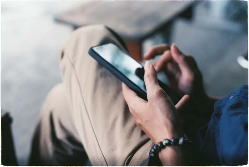
Seven seconds. That is roughly how long someone stares at a profile page before the thumb takes over and makes the call: tap, or keep scrolling. Nobody reads your bio first. They clock the photo, skim the first line, and either the link feels worth a tap or it does not.
That is the entire test, and it is brutal in a useful way. You can argue about fonts and color palettes later. First, survive the seven-second scan. Below are seven fixes that move the needle fastest, with the before-and-after thinking behind each one.
The clock starts before anyone reads a word
Here is the sequence, near as anyone can tell from behavior data: a visitor lands, registers the visual, hunts for the one thing they came for, and bails if it is not obvious. That is why a bio page with eight equally weighted links loses to a bio page with one loud button and a short list underneath. Clarity is not a design preference. It is the whole conversion.
1. Lead with the link they actually came for
Before: a bio page listing latest video, podcast, newsletter, shop, PO box, Discord, a second podcast nobody updates, and a Linktree that links to another Linktree.
After: one full-width button at the top that says exactly what the person does next — Join the Sunday newsletter, Shop the fall drop, Book a consult — followed by three to five secondary links.
Pick your primary link by asking what most visitors want, not what you most want to promote. Then test it. If your newsletter button is pulling most of the clicks and your shop button is not, the layout is answering a question honestly. Let it.
2. Design for the thumb, not the desktop
Most of your traffic is phones held one-handed, and the comfortable zone is the lower half of the screen. Anything in the top corners is decoration until proven otherwise.
Practical version: single column, buttons at least 44 pixels tall, generous spacing between them so nobody fat-fingers the wrong one, and the primary call to action reachable without a stretch. If you have to squint on a five-year-old iPhone in bright sun, so does everyone else.
3. Get under two seconds
Speed is the least glamorous fix and the one people skip. A page that loads in four or five seconds on a spotty LTE connection bleeds visitors before the first button renders.
Cheap wins: compress images before upload, drop the autoplay video background, cut the seven custom fonts down to two, and test on cellular with the phone at arm's length rather than on your office Wi-Fi. Two seconds is a reasonable target, and it is achievable on a simple bio page with almost no technical fuss.
4. Borrow trust from faces and receipts
A stranger landing on your page is doing a quick risk calculation. Help them out with a headshot that looks like a person rather than a logo, one line of specific social proof (a press mention, a screenshot of a nice customer note, a recognizable brand you have worked with), and a contact method. Skip the wall of follower counts — nobody is impressed, and it eats the seven seconds you have.
5. Cut the dead ends
Every broken link, every 'coming soon' placeholder, every link to a page last updated in the previous season teaches visitors that your page is not maintained. Do a pass once a month. If a platform died, remove it. If a collection sold out, say so or hide it. Dead ends are not neutral; they cost you the next tap.
6. Make it usable for everyone
Accessibility is not a compliance chore, it is a conversion feature. High contrast text on solid backgrounds, alt text on images, real text instead of words baked into a graphic, labels that a screen reader can announce, and no color-only cues for the important buttons. Add captions to any embedded video. Roughly a quarter of US adults report some form of disability, and plenty of the rest are reading your page one-handed in bad light.
7. Keep the promise the bio made
The fastest way to lose a visitor is a mismatch. If your bio says you write about small-business finance, the top button should not drop people on a merch store. The first screen of your bio page is the payoff for whatever the bio promised. Echo the language: same phrase, same offer, same tone.
Before: bio promises a free budgeting template, page opens with a print shop. After: the template is the first button, the print shop sits below it. Same content, wildly different tap rate.
Watching the clock with click tracking
Small fixes are only satisfying if you can measure them. Set a baseline before you touch anything: tap-through rate overall, top link, device split, and where in the page people stop clicking. On a typical creator bio page, a solid overall tap-through rate sits somewhere in the mid single digits to low teens — the ceiling depends on how warm your audience is. A new primary button, a shorter page, or a faster load can each nudge that number by a point or two, which compounds over a month of traffic.
Track per-link clicks, not just page views. Page views tell you the bio is being seen; clicks tell you whether the seven seconds went your way.
A twenty-minute audit you can run today
Open your page on your phone on cellular. Count to seven. Did you find the main button without scrolling? Was it obvious what happens next? Did anything feel slow, cramped, or broken? Fix the one worst thing, then repeat next week. That is the whole method — no redesign, no agency invoice, just a person with a thumb deciding whether you are worth a tap.