The Midnight Thumb Test: Building a Bio Page for 11 P.M. Scrolling
At 11 p.m., your bio page is not really competing with another creator's bio page. It is competing with sleep, a group chat, and the next video in the feed. That changes the job. A page built for a calm Sunday afternoon browse is often too busy for a tired thumb moving fast in a dark bedroom.
For US creators, the late-night window is not a niche edge case. It is a regular part of the media day. Someone finishes a shift, gets into bed, and keeps scrolling. They are still curious, but they are not patient. They are not going to read a paragraph of instructions, hunt for a tiny link, or squint at gray text on a black background. If your InstaBio page asks too much at that hour, they will not complain. They will just leave.
Late-night taps are a different sport
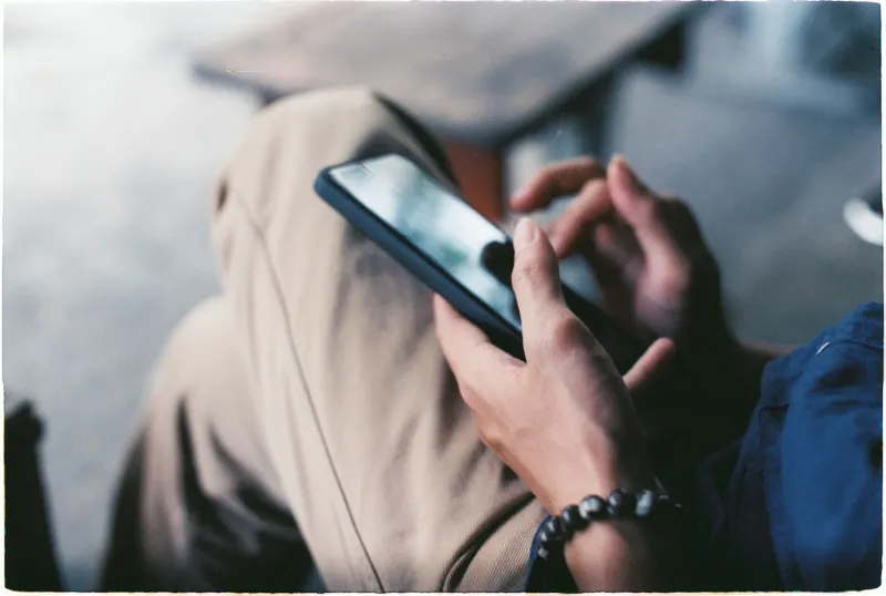
The same person who clicks carefully at lunch can become a very different visitor after 10 p.m. Attention is lower. Decisions are faster. The hand is often already occupied, which means the phone is being held one-handed and the thumb is doing most of the work. You do not need a research team to notice the shift. Sort your InstaBio analytics by hour and look for the late block. You will often see more taps, shorter sessions, and a wider gap between clicks and completed actions.
That gap matters. A click at 11 p.m. is not automatically a win. It may be curiosity, a mis-tap, or a quick look before sleep. The useful question is not only how many people tapped. It is how many tapped and then did something that counted: signed up, followed, saved, bought, or came back later. Late-night design should make the right action easy, not just make every link easier to hit.
Design for the hand, not the mouse
Start with the physical reality of a phone in bed. The top corners are awkward. Tiny text is a chore. Low-contrast gray on black looks sleek in a mockup and disappears in a dim room. A thumb needs targets that are big enough to hit without a second try. In practice, that means tap areas around 44 to 48 pixels tall, generous spacing between links, and labels that read like plain instructions instead of inside jokes.
Put the most important action in the middle or lower half of the screen, where a thumb can reach without stretching. Keep the top area for a short identity line: name, role, and the reason someone should care. Use contrast that survives a dim room. Test your page at low brightness, not just at full brightness on a desktop monitor. Avoid hover effects and hidden menus. Late-night visitors are not exploring; they are deciding.
Three layout tests you can run this week
The dim-room test is simple. Turn off the lights, set your phone to low brightness, and open your bio page with one hand. Can you tell what the page is for in two seconds? Can you hit the main link without adjusting your grip? If not, the page is asking too much.
The thumb-zone test is next. Hold the phone the way you actually hold it in bed. Mark the area your thumb can reach comfortably. Your primary link should live there. Secondary links can sit above or below, but they should not crowd the main action.
The two-second scan test is the final filter. Hand the phone to someone for two seconds and take it back. Ask what they remember. If they remember a wall of links but not the next step, the hierarchy is too flat. A good late-night page has one obvious move and a couple of clear alternatives, not a directory.
Measure click quality, not just click count
Click counts are easy to celebrate and easy to misread. A late-night spike can look great in a dashboard while producing weak outcomes. Build a simple quality check instead. Pick a window, such as 10 p.m. to 1 a.m., and compare it with your daytime traffic. Look at clicks, then look at what happens after the click. Did the visitor reach the destination? Did they complete a signup? Did they return within a few days? Did they unsubscribe immediately?
Define a qualified click for your page. For a newsletter creator, it might be a click that leads to a confirmed email address. For a shop owner, it might be a click that leads to a product view or checkout. For a coach, it might be a click that leads to a booking page. Once you define it, compare qualified clicks by hour. You may find that fewer late-night taps are worth more than a larger daytime pile of curious clicks.
Ship a calmer page
A late-night layout does not need to be boring. It needs to be forgiving. Start with a short identity line. Add one primary link with a verb-led label. Give visitors two secondary options at most. Put contact or legal links in small but readable text at the bottom. Then check the page again at 11 p.m., with one hand, in a dim room, on the phone you actually use.
InstaBio is built around one link and every click, which makes this kind of tuning practical. You can keep the page simple and still learn from the traffic. The goal is not to make your bio page look empty. The goal is to make the next tap feel obvious when the visitor is tired, distracted, and ready to stop scrolling.