The JPEG Handoff: Designing a Bio Page for the Screenshot Economy
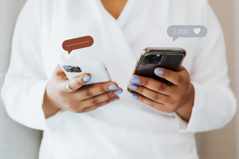
Most bio-page advice assumes a clean handoff: someone sees your link, taps it, lands on your page, maybe clicks again. Real life is messier. A friend screenshots your profile and texts it to a group chat. A conference contact saves your page to a camera roll folder called “people to follow up with.” A client forwards a cropped image to a colleague with the note “this is the person.” The browser closes; the JPEG keeps moving.
That’s the screenshot economy. In 2026, your bio page has two jobs: convert the live visitor and survive as a still image. The second job is easy to ignore because it doesn’t show up in analytics. But every screenshot is a tiny billboard for your page, and most of them are blurry, cropped, or missing the one detail that would make them useful.
Here’s how to design for the handoff without wrecking the live experience.
The screenshot is a distribution channel, not a failure
When someone screenshots your bio page, they’re not refusing to click. They’re often doing you a favor. They’re saving the information for later, sharing it with a friend, or filing it away for a project. That’s distribution. The problem is that most bio pages are designed like posters seen from three feet away, then compressed into a thumbnail seen from across the room.
Think of the screenshot as the lowest-fidelity version of your page. If the important stuff still reads there, it will read everywhere. If it doesn’t, no amount of animation or clever copy will save it.
Build for the crop, not the browser
People screenshot what fits on their screen, not what fits in your design tool. That means the top third of your page matters more than the bottom third, and the center column matters more than the edges. Avoid putting critical information in a thin sidebar or a floating element that depends on hover.
A few practical moves:
- Keep your handle, name, and one-line description above the fold.
- Use a plain background behind text. Patterns and gradients look great in a browser and turn into mud in a compressed image.
- Don’t rely on color alone to separate sections. Use spacing, weight, and simple labels.
- Make buttons look like buttons, even if they’re not tappable in the screenshot. A pill-shaped “Listen to the latest episode” reads as a next step. A row of icons does not.
The goal is not to make your page look like a screenshot. It’s to make the screenshot look like a useful summary.
Make the URL do the work
The single most valuable thing in a screenshot is often the URL. If someone can’t read it, the screenshot becomes a dead end. If they can read it, they can type it later, paste it into a browser, or find you by search.
So treat your URL like a headline. Display it in full somewhere visible—not just as the browser address bar, which often gets cropped out. Use a short, clean path. Avoid long strings of numbers, underscores, and mixed-case gibberish. If your bio page lives at a custom domain, show the domain and the path. If it lives on a platform URL, show the exact handle.
A useful test: read your URL aloud to someone who isn’t looking at your screen. If they can’t type it after hearing it once, it’s too complicated for a screenshot.
Give the QR code a job
QR codes are having a moment again, but they’re not magic. A QR code buried at the bottom of a long page will disappear in most screenshots. A QR code without a label is just a square. A QR code that points to your homepage instead of the specific thing you’re promoting is a missed opportunity.
Use a visible QR code strategy: place one near the top or in a dedicated “save this” block, keep it large enough to scan from a phone screen, and put a short URL next to it. Label what it does—“Scan to open the full page” or “Scan for the episode list.” If you’re using InstaBio or a similar link-in-bio tool, set the QR code to point to the same page people are screenshotting, not a generic landing page. That way the screenshot and the scan lead to the same place.
And remember the obvious: someone viewing a screenshot on their phone can’t easily scan a QR code on that same phone. The QR is for cross-device moments—laptop to phone, printed handout to phone, friend’s screen to your screen. The URL is for everyone else.
The three details every screenshot must preserve
If a screenshot only keeps three things, make them these:
- Who you are. Your name or handle should be large, high-contrast, and not competing with a decorative logo. People share screenshots with context, but context gets lost. The image should still answer “whose page is this?”
- One unmistakable URL. Not a shortened link that looks like a typo, not a handle hidden in small type, not a “link in bio” instruction that makes no sense in a still image. A readable URL that someone can act on later.
- The next step. A clear line that says what to do: “Book a call,” “Shop the drop,” “Read the essay,” “Join the list.” The screenshot doesn’t need every link on your page. It needs one obvious reason to follow up.
Those three details are the minimum viable screenshot. Everything else—the testimonials, the photo grid, the embedded video—is bonus.
A quick screenshot audit
Before you publish your next bio-page tweak, run this five-minute test:
- Open your page on your phone.
- Take a screenshot of the first screen.
- Send it to yourself in a messaging app.
- Look at the thumbnail before you open it.
- Ask: Can I read the handle? Can I find the URL? Do I know what to do next?
If the answer is no to any of those, adjust the hierarchy, not the decoration. Then try a second test: crop the screenshot to a square, the way it might appear in a saved folder or a group chat preview. If the core details survive the crop, you’re in good shape.
Your bio page is not just a page anymore. It’s a business card, a flyer, and a business listing that people can copy, paste, and pass around without asking. Design for the tap, sure. But design for the JPEG handoff too. That’s the version that keeps working after the browser closes.